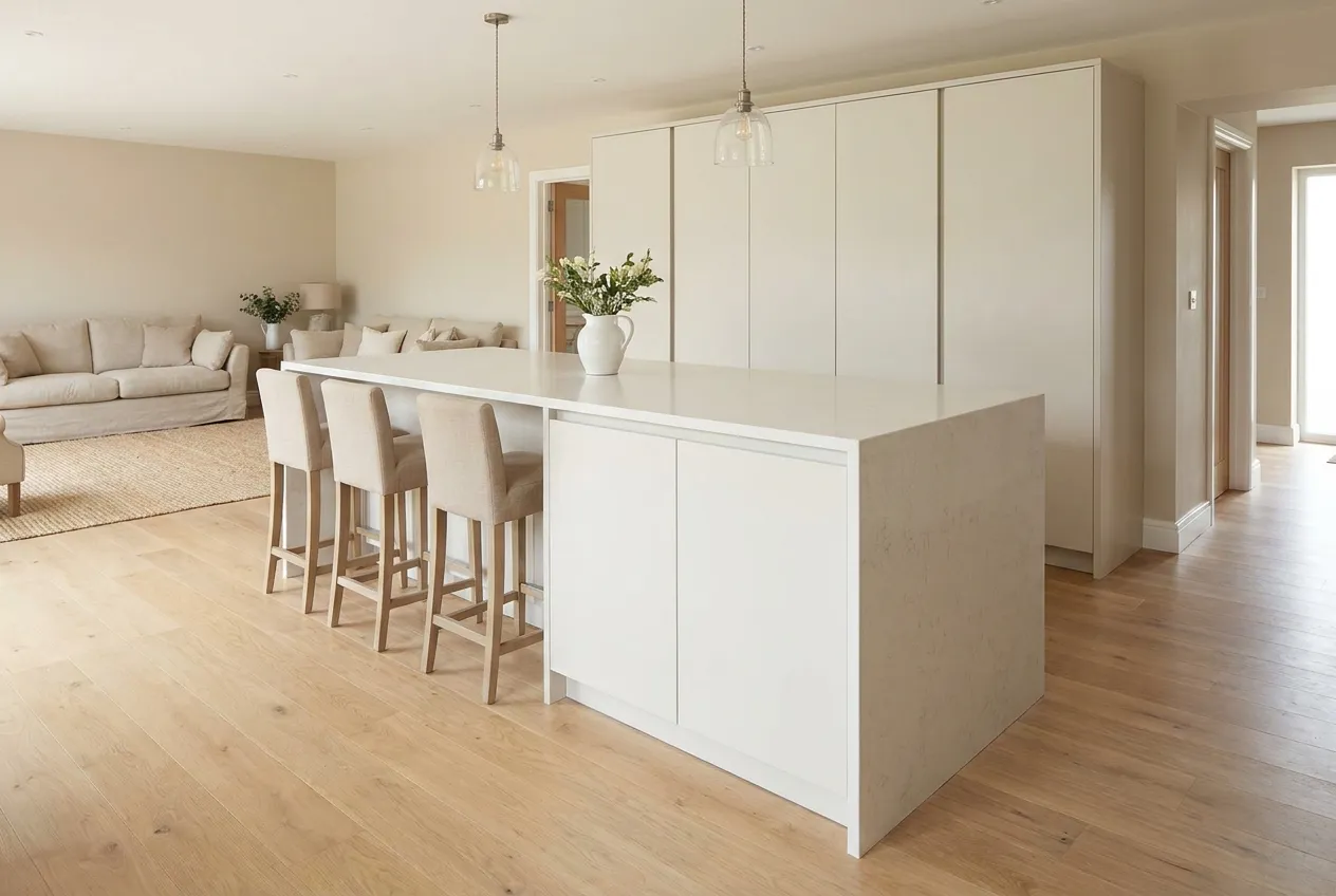
Kitchen colour scheme ideas: cabinets, walls and worktops
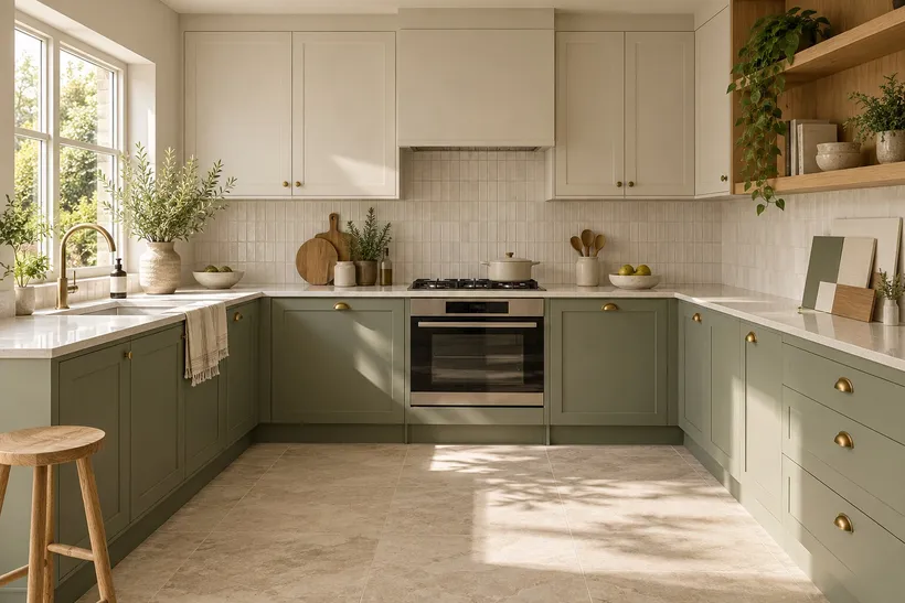
Kitchen colour scheme ideas become useful when they fit your own room. The sage cabinet that looks calm in a photograph may compete with a warm tiled floor; a white worktop may make neighbouring white doors look yellow. Before ordering a kitchen in Cyprus, put the existing finishes, daylight and evening lighting into the same decision. You are choosing a combination of surfaces, not an isolated colour from a screen.
This guide focuses on colour and finish. Cabinet dimensions, appliances and the order of installation need a separate plan; our guide to planning a custom kitchen covers that wider process. Agree the layout before spending time matching a colour for a cabinet that may move or disappear.
Start with the materials you cannot change
List what stays: the floor, window frames, doors, an existing stone worktop or the furniture in an adjoining living room. Bring physical samples together where possible. A tiled floor with a pink or yellow undertone is part of the palette even if you describe it as beige. Wood, stone veining, grout and metal handles also contribute colour; they are not neutral simply because they are natural materials.
Choose one surface to lead the composition. If the worktop has strong movement, quieter cabinet fronts and a simple splashback often make it easier to live with. If everything else is restrained, the cabinets can carry a more distinctive colour. This is a way of setting priorities, not a rule that every kitchen must contain a fixed number of colours.
- Photograph the finishes that will remain, but label the photographs as references rather than colour standards.
- Collect actual cabinet, worktop, floor and grout samples; note product codes and finish names.
- View the group from the kitchen entrance and the living room as well as close to the worktop.
- Separate expensive permanent choices from paint, stools and textiles that are easier to update.
How daylight and evening light change the scheme
A bright Cypriot kitchen does not have one constant kind of light. Orientation, shade from a veranda, nearby buildings and the time of day all affect what reaches the surfaces. Sunlight does not inevitably make every cool colour colder. A cabinet can look different beside a window and at the end of a shaded run, and a room used mainly in the evening must be judged under its evening lights.
Place cabinet samples vertically, worktop samples horizontally and the splashback upright behind them. Check them in the morning, later in the day and after dark, with the lights you intend to use. The Benjamin Moore colour handbook also recommends observing paint samples in changing light. Use that principle to compare your actual materials, rather than copying the colour shown in a manufacturer's photograph.
Do not change every lamp midway through the selection and assume the approved palette will look identical. Record the chosen lighting alongside the finish schedule. If a white sample suddenly looks odd, compare it with its neighbours and the light source before deciding that the paint or cabinet was supplied incorrectly. A photograph with automatic white balance cannot settle that question.
Kitchen cupboard colour ideas: white, grey and wood
White cabinets can reduce the visual weight of a large run, particularly when tall units extend to the ceiling. But white is a family of colours. A warm white beside a very cool worktop can look creamy, while two almost-matching whites may appear less intentional than a clear contrast. Compare the complete door with the end panel, plinth and worktop edge, not only a small colour chip.
Whether a matt grey kitchen feels quiet or heavy depends on the grey itself, as well as on the room and the surrounding materials. Test whether the sample leans blue, green, violet or warm beige when placed beside the floor. Matt describes the finish, not a promise that marks will disappear. A medium tone with some texture may conceal day-to-day variation differently from a very smooth uniform surface; test the specific product.
Wood adds grain as well as colour. If the floor already has a strong pattern, compare a calmer veneer with a busier one before adding another wood effect. Matching two wood finishes exactly is difficult and is not always necessary. An intentional difference in tone can be more convincing than a near-match that changes under evening light.
Dark cabinets and two-colour kitchen ideas
Even a compact room can take a black or deep blue kitchen, provided you like the resulting contrast and have useful task lighting. Darkness is not automatically a design mistake, and white paint cannot correct a poor layout. Check the large vertical surfaces from the doorway: a dark bank of tall cupboards has a different effect from a dark base run beneath a light wall.
With two-colour kitchen ideas, divide the colours by a clear part of the design: base units and tall units, one continuous run and a separate island, or cabinetry and an open shelf. Avoid alternating doors simply to use both samples. Follow the colour around visible end panels and side returns, so the scheme still makes sense when seen from the sofa or terrace door.
If the island is the accent, test its relationship to dining chairs and pendant lights as well as the kitchen run. A dramatic colour is less helpful if the island blocks movement; our guide to kitchen islands and breakfast bars explains the planning questions. Colour should reinforce a workable arrangement rather than distract from one.
Kitchen wall colour ideas, splashbacks and worktops
Kitchen wall colour ideas should account for how much wall will remain visible. A shade that looks intense on a sample may occupy only a small strip above cabinets; a supposedly neutral colour can dominate a long wall in an open-plan room. Look at it beside curtains, the sofa and the view through adjoining doorways. The kitchen does not stop visually at the last cabinet.
Use the splashback to connect surfaces or to provide one deliberate contrast. With veined stone, inspect the actual slab or the selected pattern and decide which colour within it should relate to the doors. For tiles, include grout in the sample arrangement: a contrasting joint changes the pattern considerably. Check sockets and trims too; their colour remains visible after installation.
Paint near a cooking or washing zone must suit the particular location and cleaning needs. The colour name and a generic description such as satin are not enough to choose a product. Ask for the relevant technical information, preparation and care instructions. A decorative wall finish is not a substitute for a suitable heat-resistant or splash-resistant surface where the appliance and installation require one.
Paint colour ideas for small kitchens
For a small kitchen, start by reducing unnecessary breaks between surfaces. Similar tones on a tall cupboard and its adjacent wall may make the outline less prominent. This does not mean every surface must be identical: a distinct worktop can still provide a useful visual edge. Judge the whole view, including handles, appliances and the floor, rather than counting colours in isolation.
For a practical comparison, make two small sample sets. One might combine warm white doors, a pale stone surface and oak; another might use sage base units, an off-white upper section and a quiet floor. Neither is a universal solution for Cyprus. Place both sets in your room and reject the one that clashes with the fixed surfaces or feels wrong at the time you use the kitchen most.
Keep optional accents in replaceable elements when you are uncertain. A stool seat, wall paint or a textile can introduce a stronger colour without committing all the doors to it. In a rental property, also consider whether the finish can be repaired or matched later. Ask how replacement panels are identified and whether touch-up products are appropriate for the chosen surface.
Check the finish with real daily use in mind
Request a sample of the actual door finish, not a paint card standing in for laminate, lacquer or foil. Look at edges, joins and the area around a handle. On a supplier-approved sample, try the recommended cleaning method after ordinary handling. Do not test abrasives or solvents that the manufacturer prohibits. Dark smooth surfaces may show pale dust and water traces; glossy surfaces may show reflections and fingerprints. The extent depends on the product and the light.
Sun exposure is a separate durability question. Ask the supplier about the material's intended use, colour stability and warranty conditions, especially for doors exposed to direct sunlight through large glazing. A pale colour is not proof of UV resistance. Record any shading requirement and use compatible cleaning products, because the way a finish is maintained can affect its appearance.
Who can help you choose and specify the colours?
A kitchen designer can coordinate the palette with cabinet proportions and lighting. A custom kitchen maker should supply representative door samples and a written finish schedule; for walls, compare specialists in plastering and painting. Browse kitchen design projects for combinations, then test the materials in your own room rather than ordering by photograph.
Approve a short schedule containing the supplier, product code, colour, sheen, edge finish, visible panel locations and lighting assumptions. Keep an agreed sample and ask how substitutions will be approved. Check the delivery against that reference before installation. A written specification is especially useful when several trades supply surfaces described by the same everyday word, such as white or grey.
Frequently asked questions
Which kitchen colour is the most practical?
There is no colour that hides every mark. Compare the actual finish under your lighting and consider the marks your household creates most often. Cleaning instructions, texture, handle placement and the ability to repair a panel can matter as much as its shade.
Will matt dark doors show fingerprints?
They can. Matt is an appearance category, not a guarantee of fingerprint resistance. Ask for the specific product's performance and try an approved sample. Avoid choosing from a pristine showroom door that nobody is allowed to touch.
Should the wall and the cabinets be the same white?
They can be, but different materials and sheen levels may still look different. Compare real samples together. If a near-match looks accidental, a deliberate contrast may be easier to control than trying to make paint and a factory finish visually identical.
Can I choose the whole kitchen from an online visualisation?
Use it to compare the overall distribution of light and dark surfaces. Screens, photography and rendering settings alter colour, so confirm the final palette with physical samples on site. The approved product codes and samples should remain the ordering reference.
Other articles